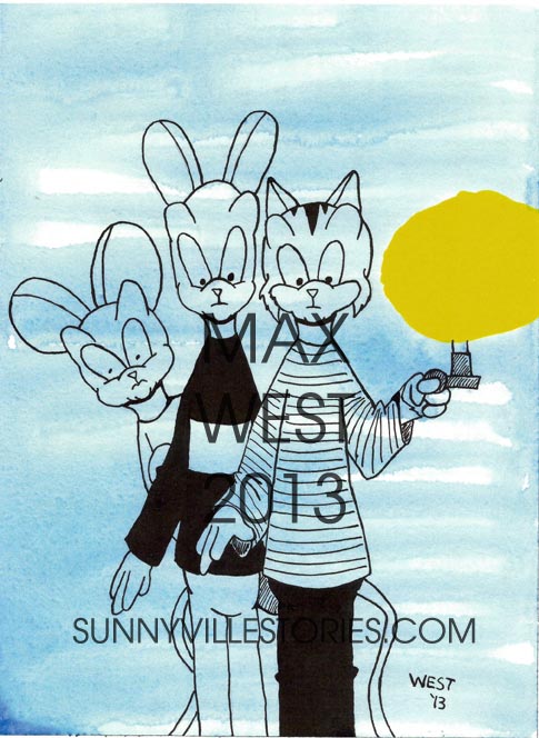
Today, I’ll share one of my paintings with you. This is one that I plan to display at Anthrocon this July and it also may be a cover in the future.
The piece is called “Strangers in the Night” and was partly influenced by film stills of the Three Stooges, whom I’ve considered Rusty, Ragnar and Olaf to be much like. Prints of this are available on DeviantArt.
So how did I come up with this work? I’ll show you.
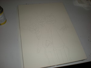
Working from a block of hot-press watercolor paper (it has a smooth surface), I sketched out the drawing using 2H pencil and then tightened it up with an HB pencil. I had a clear idea of what I wanted in this design so there was no need to do preparatory sketches – which I usually do when I do painting. Once the finished pencils were the way I wanted them, it was time to move onto the next step.
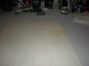
I’m going to put down a wash of paint, but before doing that, I wanted to block out the area that will be the light provided by Rusty’s candle. Some painters using watercolors (or a reasonable fascimile thereof) will block out areas they want to paint over with masking fluid. I use a cheaper, yet equally effective alternative – rubber cement. Once the rubber cement was dry, it was time to start painting.
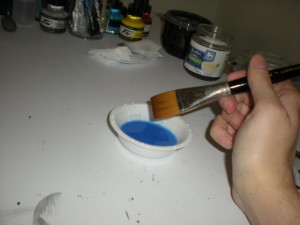
Rather than watercolor, I took some ultramarine acrylic paint (a dark shade of blue) and diluted it with lots of water. The paint was then applied with a wash brush (shown in my hand their in the photo). I chose acrylic for a reason. Acrylic becomes insoluble once dry and that will become important because I’m going to draw in ink over the dried paint. Doing this with watercolor could cause the ink to bleed into the paint and that would be messy.
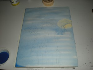
This is what the work looked like after I laid the wash down. It needed to dry so I stepped away and let it dry.
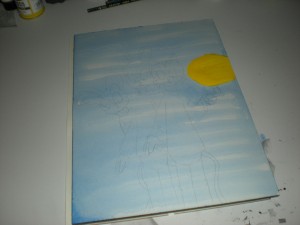
See what I did with the rubber cement? It resisted the wash of acrylic. Once the paint was completely dry, I used an eraser to lift and remove the mask of rubber cement. With that gone, I had a blank area that was untouched by the paint.
I used acrylic ink for the yellow flame of the candle. Now, those of you familiar with color theory know that the complementary color to blue is orange. Originally, I considered making the flame orange so it would give a contrast to the blue wash. But I chose not to do that. I chose yellow instead. Why? Again, if you know your color theory, blue and yellow are two of the three primary colors. People notice primary colors. Therefore, this work will grab the attention of viewers.
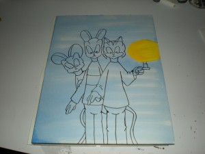
Once everything was dry, I started the inking. I drew over the pencil lines, still showing through the paint. That’s how the drawing looked when I finished the lines. After that dried, I spotted in the black areas and did patterns.
The finished product at the start of this post is the final result.
And this will be at Anthrocon 2013. Be sure you bid on it! Till next time, friends.

