Welcome back, friends. I have a few more conceptual pieces here for Sunnyville Stories episode 5. First, I need to make a brief announcement. Next Saturday, I will be heading to Huntsville, Alabama. This will mark the first time in sixteen years that I’ve been south of the Mason-Dixon line. Why am I going there? I will be attending an event down there called Rocket City Furmeet. My work will be displayed in the art show and I’ll be there to promote Sunnyville Stories. Believe me, I’ll have a full report and photos when I return. And now, on with the show.
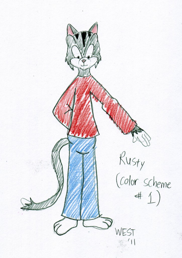
This work you see here is a rough color study for Rusty Duncan. Some of you who have read my comics know that I work in black and white. So then why would I need a color study? Well, the covers for one thing. It’s not only for my reference, but for the reference of others. I’m planning to have a guest artist do a cover for the fifth episode of Sunnyville (more on that in a moment).
Rusty’s usual outfit is a red shirt and blue pants. I have to be honest with my readers – color theory is NOT my strong point. In the past, I treated images like those coloring books we used to have as children. But there’s more to color than just slathering hundreds of them on the page. I learned soon enough that less is actually more. Too many colors make an image look weird and full of discord.
At present, I cannot offer any strategies on color theory. My advice is to study it on your own. There are some very good resources out there. Books I recommend on the subject are the DC Comics Guide to Coloring and Lettering Comics by Mark Chiarello and Todd Klein and Color: A Course In Mastering the Art of Mixing Colors by Betty Edwards.
Anyway, Rusty is colored red and blue for an important reason. Those are primary colors. Therefore, they stick out and Rusty will get noticed on the covers as well as the promotional artwork I do. Simple, isn’t it?
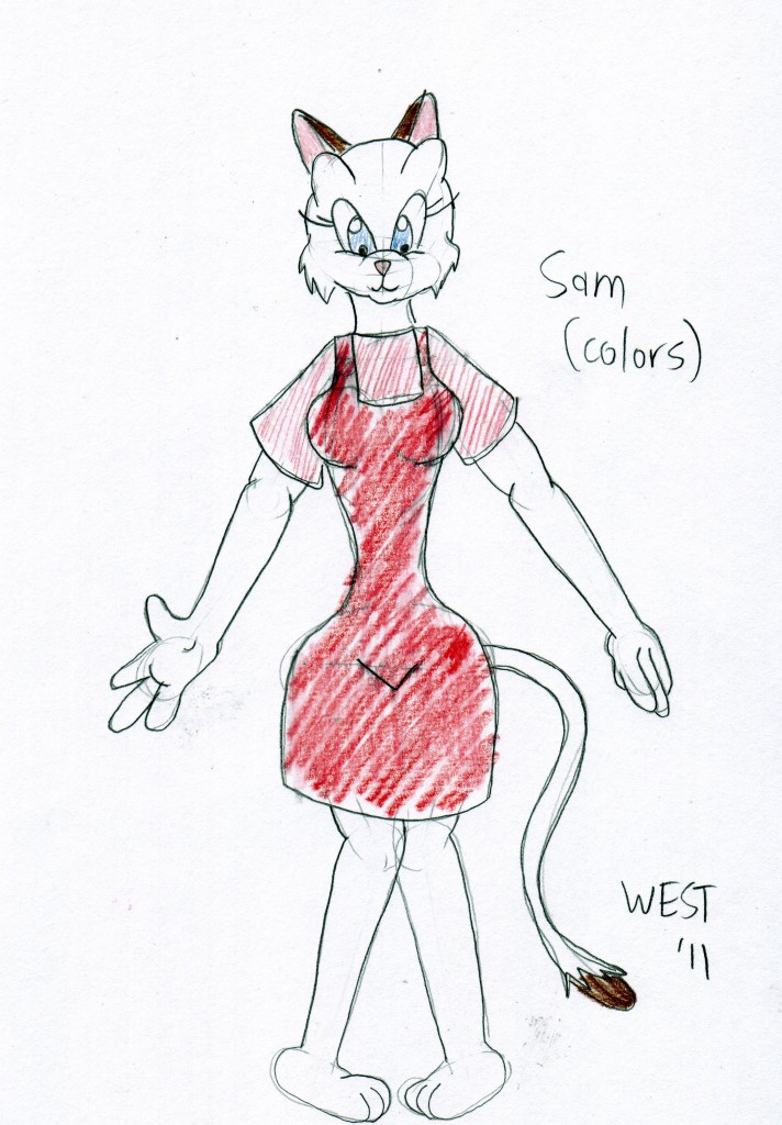
Sam’s colors took a bit longer to do. After trying out a few ideas, I gave her a pink color scheme for her clothes. She wears a light pink blouse and a darker pink jumper. Actually, red and pink happen to be related – pink is red mixed with white. To create that jumper, I had to blend red and white colored Koh-I-Noor pencils. It works. In addition, colors take on meanings too. Pink is usually considered a feminine color so here it helps to identify Sam as being a girl. It’s simple but effective.
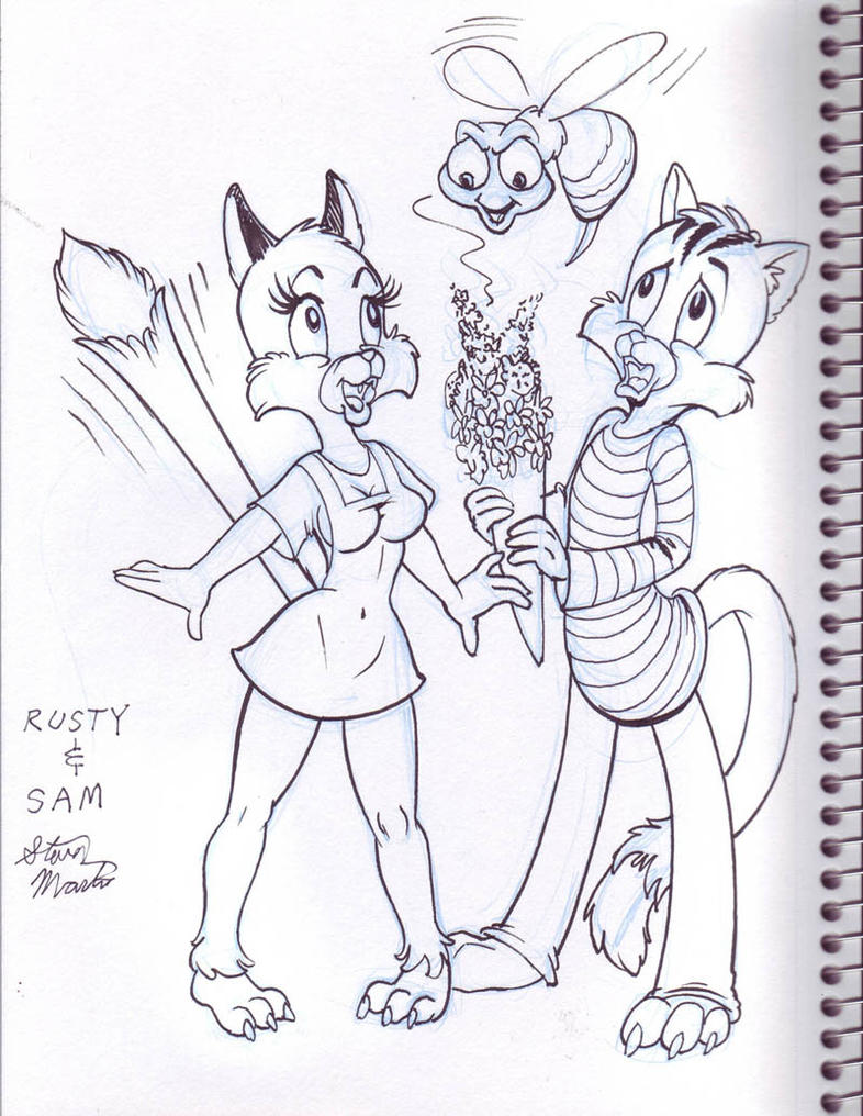
Anyway, there’s a reason why I’m doing these studies. It’s not just for my reference. It’s for the reference of others. In fact, I plan to have a guest artist do the cover for Sunnyville Stories episode 5. That guest artist will be Steven Martin of Santa Ana, California.

Steven Martin
Steven Martin is a professional artist I’ve bought artwork from in the past…but it wasn’t until Further Confusion 2010 that I actually sat down and talked to him. He’s done a lot of artwork within the fandoms of furry, science fiction, and cartoons for ages. He’s also worked for various companies as a freelancer such as Disney, Mattel, Nickelodeon, Warner Brothers, and Uncle Milton Industries. We roomed together at Anthrocon 2010 in Pittsburgh, Pennsylvania and again at Further Confusion 2011. It was during these events I told him about Sunnyville Stories and I even approached him about doing a cover. While at FC 2011, he actually did this image of Sam and Rusty.

Wow! I’m looking forward to see what he ultimately comes up with.
Well, that’s all the art for this week. I’ll definitely have some more art up for you while I’m away in Alabama.
Don’t forget to subscribe via email or RSS feed. And I’d like to hear back from you. How do you like my artwork? Are any of you knowledgeable about color theory? How do you incorporate color into your work? I’d like to know.


