Ladies and gentlemen, today I’m going to talk about a subject that is another big part of making comics. If you didn’t read my tutorial about to actually put together a comic, then go back now and read over them.
The topic for today is how to do a cover for your comic. This is necessary, whether you do small press or superhero, print or digital. Before we continue though, I need to put in a disclaimer. Just like with making comics, making a proper cover is more of alchemy than science. There are no hard and fast rules for doing a cover. If you are working with or for an editor, they usually have some say in the final cover but what they say is often 100% opinion. It’s possible to have an amazing cover and not sell as well as to have a lousy cover and sell very well.
That said, a cover is very important to a comic. The cover usually sells the title. If the cover catches someone’s eye, that will probably mean a sale. If it doesn’t stand out or catch people’s attention, that means a lost sale.
In a bigger company like DC or Marvel, it’s usually the editor who comes up with the idea for the cover and a cover artist to actually draw it. In smaller operations, the cover design may be left up to entirely one person.
Like I said before, there are no hard and fast rules. However, what I do is try to make my covers eye-catching. With my single issue comics, I tend to be more experimental and avant-garde.

Take the cover to Sunnyville Stories #8. This was meant to be a parody of the Queen album “News of the World”. Besides the obvious parody reference, the red in the picture contrasted against the greenish background was also meant to get people’s attention – anyone knowing color theory will realize that red and green are complementary colors. When juxtaposed, their contrast provides a powerful visual.

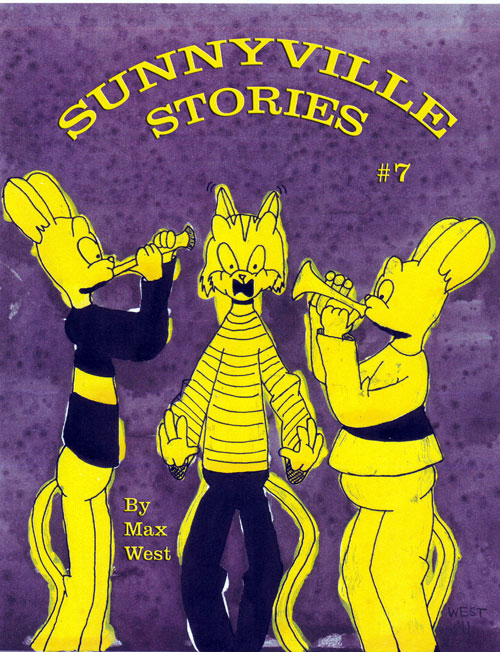
Here’s another cover I did for Sunnyville #7. The complementary colors of purple and yellow are also eye-catching and provide for a potent visual experience. Both of these covers did serve me well – I sold out of both issues at FM Comicon last month!
As for the trade paperbacks, I’m a little more conservative with those as they are intended for the bookstore & library market.

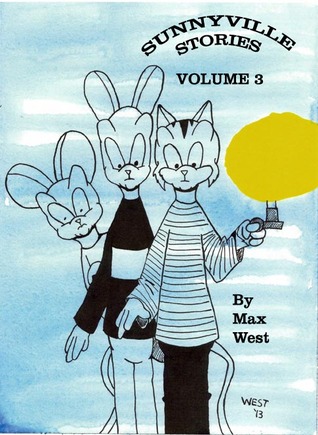
Sunnyville Stories Volume 3 Cover
This is the cover for the Sunnyville Stories Volume 3 trade paperback. While I try to avoid any parodies or pop culture references, I still work to catch the eye of potential buyers. Besides the use of a title logo and featuring the protagonist, Rusty Duncan, on the cover, I’m using two of the three primary colors – blue and yellow. These colors do get the attention of buyers.
Some guidelines to remember when you do a cover:
- Have the title, the issue number (if applicable) and the name of the artist on the cover.
- Feature the protagonist on the cover to reinforce the focus of the comic.
- Use of color is handy. Go for primary colors like red, blue and yellow or complementary combinations like blue/orange, red/green or yellow/purple.
Well, that’s all for now, friends. Sign up for the Sunnyville Stories mailing list if you haven’t yet. Stop over to DriveThru Comics for digital copies of Sunnyville Stories. Copies of Sunnyville Stories Volume 1 are still for sale on Amazon, both in print and Kindle formats! While you’re there, be sure to pick up Sunnyville Stories Volume 2 and (if you love Gothic horror) Von Herling, Vampire Hunter! And now available is the latest installment of the saga, Sunnyville Stories Volume 3. Get them today!
Copies of all the above titles are available to the library trade via Brodart Company and to retailers from Ingram and Baker & Taylor (via BCH Distribution). Copies are also available direct from the publisher. For ordering information, contact maxwestart(at)gmail(dot)com or write to:
Different Mousetrap Press LLC, 1100 19th Avenue N, #108, Unit J, Fargo ND 58102-2269 USA
