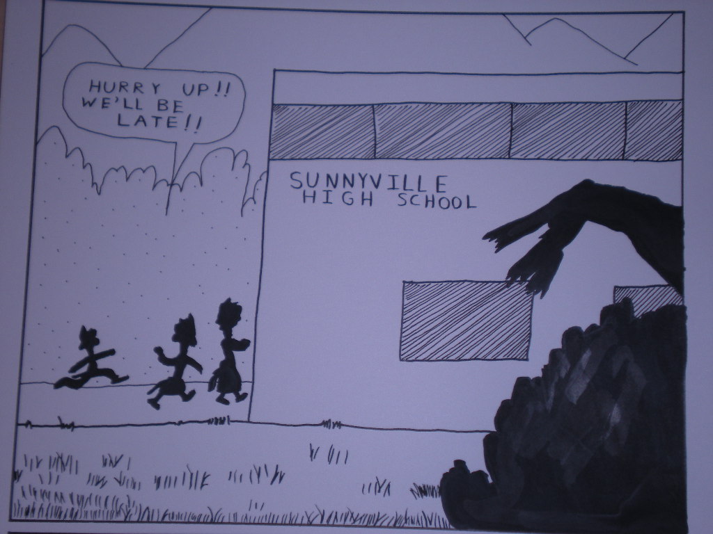
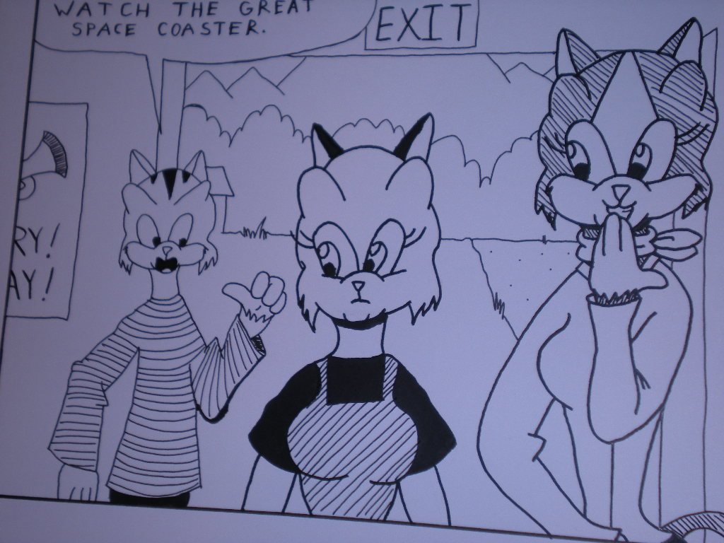
I’m down to inking the last quarter of pages of Sunnyville Stories episode 6. Today, I thought I’d share with you some of the pages I’ve gotten finished and inked. I’ll compare them to with the pencils to show you the differences between them as well as the necessity of inking in comics.
Take a look back at the first pencils I did to episode 6. Go on – I’ll wait.
Now, let’s compare that to the inking I’ve done.
The pencils looked quite faint. These however look A LOT MORE crisp and defined. I reiterate that pencils do not reproduce well and that’s why inking comics is very important.
The lettering definitely looks better now that I’ve incorporated the use of Speedball C6 nibs into my toolbox. The only problem I have with this inked panel is that the greenery there in the foreground looks a bit washed out. That may or may not show up well on the final copies. I’ll probably have to go back over it. This is also why I emphasize having a good India ink that gives a rich enough black on the page.
Again, you see here that the inked work looks much more defined than its pencil version. I’m also employing thin versus thick lines here. Notice Margaret and Samantha. Since they are in the foreground while Rusty is the background, the girls have thicker lines composing them. That was done with a Speeball A5 nib, a lettering nib that gives a fat and uniform line. Rusty contrasts with them as he was inked with a 0.50mm Rapidograph.
That’s all for now. I’ll have some more panels up next time. Subscribe via RSS feed or through email if you haven’t already. Be sure to stop by Indy Planet to buy your copy of my first book, Sunnyville Stories Volume 1, as well as my other comics. As always, your feedback is appreciated. What’s your opinion? We’d like to know.


