This week, your humble creator, Max West, has a book review up. It’s something that can help anyone who works in comics and maybe even in filmmaking. This book review is for Framed Ink: Drawing and Composition for Visual Storytellers by Marcos Mateu-Mestre.
Framed Ink is a title published in 2010 by Design Studio Press. Consisting of 128 pages, the book takes a look at a variety of angles and shots you can use for composing comics layouts. Some of you may remember that I did emphasize the importance of this in one of my making comics posts.
The book opens up with a first chapter explaining how shots have to be considered. What is the tone of the story? What is the feel? How do you show rather than tell? That becomes very important because it sets up the whole objective of the book. The best part of the book and the section that makes this text worth its cost is a whole section on how to set up comics panels.
Before I go any further, I should talk a bit about the book’s author. Marcos Mateu-Mestre is a visual concept artist and has worked in both comics and animation. His credits include such films as Balto and the Prince of Egypt. This author is actually one that walks the walk and talks the talk. So when he speaks…or, in the case of this book, writes, you’d better listen…or read. But I digress.
Getting back to the chapter I was talking about, it’s the third chapter of the book. Marcos Mateu-Mestre shows various examples of how to convey some sort of visual message in each example such as order versus chaos, looking up and looking down, use of negative space, and so forth. Each example is illustrated by a rendered drawing, an abstract thumbnail displaying the aspects of said drawing, and a brief text explaining these principles in detail. The other chapters of the book are quite informative as well. The book also explains how these principles apply to a graphic novel in addition to composing purposeful sequences in a proper order.
Some of you are wondering what this has to do with this blog and with Sunnyville Stories. My purchase of this book was an accident. It was during the development of the fourth episode of Sunnyville Stories (available for purchase BTW) that some criticized my panel shots as being too many medium and close-up shots. There wasn’t a variety of juxtaposition of other shots. That’s what prompted me to get a copy of this book from the Barnes and Noble of Union Square in Manhattan.
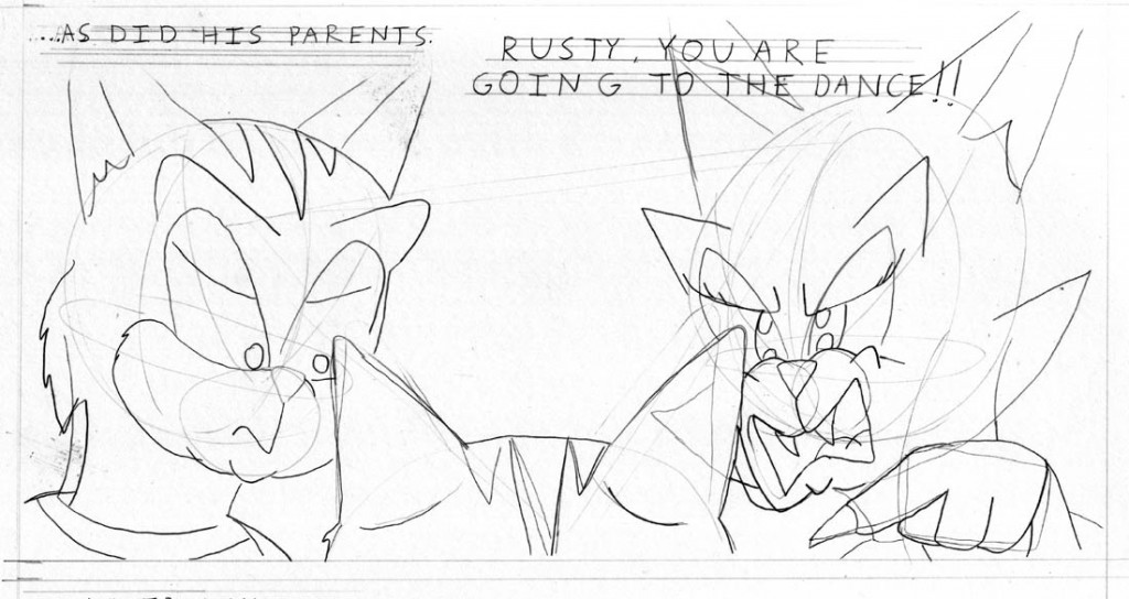
Almost immediately, I applied what I learned into my comics. Let’s take a look at example from the fifth episode of Sunnyville, currently being pencilled at the time of this writing.
As some of you may recall, the plot to episode 5 involves Rusty being forced to go to a dance by his parents – an event that he’s terrified of going to because he can’t dance!
The original thumbnail was more of a flat side view. It wasn’t bad by any means, but I felt I could do more with it. So I pulled out my copy of the book and studied it for some ideas. This is a tense moment for Rusty. His parents are laying down the law and making it clear that he WILL go to the dance. I wanted to convey a feeling of power vs. powerlessness, so I made sure that Rusty’s parents are towering over him.
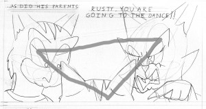
 If you take a look at the abstract of this panel, you’ll notice it is based on a triangle. It really works well here and the advice I got from Marcos Mateu-Mestre’s book turned out to be priceless.
Overall, Framed Ink is an extremely handy book for anyone who makes comics or film. This belongs on everyone’s shelf. What more can I say? It’s a first-rate book written by a first-rate expert.
Any questions or comments? Does anyone else here have a copy of the book or have read it? What do you think about it? Feel free to leave your feedback here.
Be sure to subscribe via RSS feed or via email if you haven’t already. Until next time, this is Max West saying goodbye and telling you to get a copy of the super book by Marcos Mateu-Mestre, Framed Ink.

